The 1973-1986 Definitives - Shades of Colour
As promised, I am going to dive right into this fascinating set. One of the most amazing aspects to collecting this issue is the vast array of different colour combinations that are found on each printing of each value. For a modern set such as this, this is highly unusual because modern stamps, especially those that have been printed using modern techniques like lithography and photogravure, are know for their uniformity of colour.
The stamps in this set were printed using a combination of 4 colours ore more, with each colour being used for a different part of the design. The colours were each printed separately by passing the sheets through the presses multiple times. Most of the time the colours are pure colours, but occasionally the colour you see results from the mixing of two or more colours. I have found variations in each component colour, and often the variations will be found in many permutations and combinations. Some differences are so dramatic, it is hard to believe that Scott or Gibbons does not list them separately.
Below are some images of the variation found on each value:
Here the top 5 stamps are lithographed, and show the most variety in the background colour and the colour of the field. But again, the herdsman and the cattle show subtle variation as well. The last two stamps are the original 1973 photogravure printing and these two are as different as night and day, once again.
Again, some subtle difference in the green and yellow colours on the 2N. The top stamp is lithographed for sure. The catalogues suggest that all of the 2N's were lithographed, but I think the bottom stamp is photogravure.
I have not illustrated the 7k, 8k, 15k, 18k, 25k, 30k, 35k, 50k or 1N values, but these exhibit many shades as well, although they tend to be more subtle than say the 5k or 10k values.
The stamps in this set were printed using a combination of 4 colours ore more, with each colour being used for a different part of the design. The colours were each printed separately by passing the sheets through the presses multiple times. Most of the time the colours are pure colours, but occasionally the colour you see results from the mixing of two or more colours. I have found variations in each component colour, and often the variations will be found in many permutations and combinations. Some differences are so dramatic, it is hard to believe that Scott or Gibbons does not list them separately.
Below are some images of the variation found on each value:
The top four stamps are all later printings produced by lithography, while the bottom two are the original photogravure printings. The bottom two stamps are night and day - the dark colour in the first one is brown, while in the bottom stamp it is black. This is not a simple shade variety, but rather an entirely different colour. The other major difference is in the foliage, which on the last stamp is very dark green and on the second last stamp, an emerald green. The background colour on these two stamps is a pale flesh colour.
On the lithographed stamps the background colour becomes darker and more tan. The dark colour on all of them is a dark brown and the main difference is the folliage, which is a dark green that varies considerably in its intensity and tone.
Now lets look at the 2k value, as it also exhibits some fairly dramatic variations in colour.
Again, the top 4 stamps are lithographed, while the last one is the original 1973 printing. The most marked differences are in the violet and magenta, but if you look closely you can also see variations in the black and the blue.
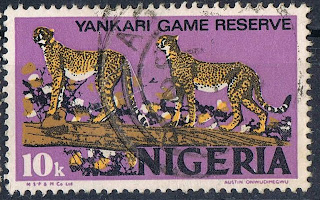
Now for the two values that show, hands down the most variation: the 5k Cattle Ranching and the 10k Yankari Game Reserve.
The first three and last 10 stamps are all printed by lithography. The fourth stamp is the original 1973 printing. The colour of the cheetahs and the log differ slightly on all stamps, but the biggest difference is the background colour. Some of the inks on this stamp glow bright fluorescent under long wave ultraviolet light.
Some slight variation between the lithographed and photogravure printings of the 12k.
The first three stamps are the lithographed printings, as is the last, while the fourth is the original photogravure printing. The most marked difference is the colour of the liquid in the flasks, which changes from black, to grey-violet to blue. The colour of the windows and table also shows a lot of variety.
I have not illustrated the 7k, 8k, 15k, 18k, 25k, 30k, 35k, 50k or 1N values, but these exhibit many shades as well, although they tend to be more subtle than say the 5k or 10k values.
.jpg)
.jpg)
.jpg)
.jpg)
.jpg)
.jpg)
.jpg)
.jpg)
.jpg)
.jpg)
.jpg)
.jpg)
.jpg)
.jpg)
.jpg)
.jpg)
.jpg)
.jpg)
.jpg)
.jpg)
.jpg)
.jpg)
.jpg)
.jpg)
.jpg)
.jpg)
.jpg)
.jpg)
.jpg)

.jpg)

.jpg)
.jpg)
.jpg)
.jpg)
.jpg)
.jpg)
.jpg)
.jpg)
.jpg)


Comments
Post a Comment