The Overprinted Great Britain Issues Of Niger Coast Protectorate 1892-1894 Part Five
This week will be my last post about the overprinted issues of Great Britain that were produced for use in the Niger Coast Protectorate. This week, I will look at some larger mint multiples of the overprinted issues, as well as the provisional surcharges that were issued at Old Calabar and Opobo between September and December 1893.
These surcharges together constitute one of the most elusive and expensive areas in all of British Commonwealth Philately. A staggering 38 basic provisional surcharges were produced, and some of these list in Gibbons for up to £140,000 each. In addition to the basic Gibbons listed numbers, most of these surcharges exist in different orientations from the normal setting, so vertical, inverted, diagonal etc., as well as doubled. Most of these are insanely rare, with fewer than a dozen examples known in most cases. The main reason for the immense rarity of these surcharges is that each stamp in a typical sheet of 60 received a slightly different surcharge, and this accounts for the staggering number of listed varieties. Because of this rarity, it is advisable to only buy them with certificates. That being said, once you know what the inks used for the genuine overprints look like, it will be fairly easy to spot the originals and distinguish them from the many fakes that are out there. I have a small number of genuine examples, which I will show here as well as some high quality fakes that have been produced using, what appears to be, a laser printer.
The provisional surcharges can be subdivided into five groups as follows:

If you look carefully at the above, you will see that the dividing line is generally well aligned with the corners and that the red ink is not fully saturated. It has a somewhat vermilion quality to it and you can still see the underlying stamp design through it. This is important, as these characteristics will help distinguish it from the common forgeries that are so often found, as we shall see.
The next scan shows a close up of the surcharge:

Note how the 2 and the d are broken in places. This is another important characteristic of the genuine overprint.
Here is another genuine example. This time the dividing line does not exactly meet the top right corner of the stamp. However, the surcharge possesses all the characteristics of a genuine overprint.


The letters and numerals are too thick and not broken or thin in any place the way that they are with the genuine surcharge.
Here is a forgery of the violet surcharge:


As you can see the green is a basic green colour - not yellowish and not bluish. The letters are also somewhat broken, as was the case with the Old Calabar surcharge that I first looked at here.
Here is the blue overprint:


Here is another obvious forgery, this time of the red surcharge:


If you look in the white space around the Queen you can see dozens of tiny blue dots.
Here is the facsimile:


These surcharges together constitute one of the most elusive and expensive areas in all of British Commonwealth Philately. A staggering 38 basic provisional surcharges were produced, and some of these list in Gibbons for up to £140,000 each. In addition to the basic Gibbons listed numbers, most of these surcharges exist in different orientations from the normal setting, so vertical, inverted, diagonal etc., as well as doubled. Most of these are insanely rare, with fewer than a dozen examples known in most cases. The main reason for the immense rarity of these surcharges is that each stamp in a typical sheet of 60 received a slightly different surcharge, and this accounts for the staggering number of listed varieties. Because of this rarity, it is advisable to only buy them with certificates. That being said, once you know what the inks used for the genuine overprints look like, it will be fairly easy to spot the originals and distinguish them from the many fakes that are out there. I have a small number of genuine examples, which I will show here as well as some high quality fakes that have been produced using, what appears to be, a laser printer.
The provisional surcharges can be subdivided into five groups as follows:
- The Old Calabar Half Penny Provisional
- The Old Calabar "Half Penny" Surcharges.
- The Old Calabar "One Shilling" Surcharges.
- The Old Calabar 5/- and 10/- Surcharges.
- The Opobo Provisionals
The very large number of different typefaces used and the fact that the surcharges were produced in such a way as to make the majority of them extremely rare does tend to suggest, quite surprisingly to many philatelists, that these issues, while having postal necessity owing to a shortage of halfpenny stamps were largely philatelic in nature. These issues are a perfect example to show to those collectors who eschew philatelic material, as being a largely modern creation, that philatelic issues indeed go all the way back well into the 19th century.
The Old Calabar Half Penny Provisional
On September 3, 1893, sheets of the 1d lilac were surcharged with a 1/2d in either red or violet and had a dividing line diagonally from one corner of the stamp to the other. Generally this line ran from right to left so that this made a "pair" out of each stamp. The pairs of red and violet surcharges were produced se-tenant in the sheets. Se-tenant pairs of unsevered pairs and unsevered pairs of these stamps are extremely rare and worth tens of thousands of pounds. The majority of stamps surcharged, were done in red, while only a few stamps in a sheet were surcharged in violet. This accounts for the huge difference in catalogue values (£140-160 for red versus £5,000-7,000 for violet. The red surcharge can also be found with the surcharge reversed and inverted and reversed. In these cases, the dividing line runs from left at the top to right at the bottom.
The scans below show two genuine examples of the red surcharge:

If you look carefully at the above, you will see that the dividing line is generally well aligned with the corners and that the red ink is not fully saturated. It has a somewhat vermilion quality to it and you can still see the underlying stamp design through it. This is important, as these characteristics will help distinguish it from the common forgeries that are so often found, as we shall see.
The next scan shows a close up of the surcharge:

Note how the 2 and the d are broken in places. This is another important characteristic of the genuine overprint.
Here is another genuine example. This time the dividing line does not exactly meet the top right corner of the stamp. However, the surcharge possesses all the characteristics of a genuine overprint.
Now, you may have noticed that both examples show a curved top to the "1" in 1/2. There is a variation of the overprint that is worth more that shows a straight top to the "1".
Here are two examples of forgeries made with genuine overprinted stamps, onto which the dividing line and surcharge have been added using an ink-jet printer:

Here is a forgery of the red overprint. Note how strong the colour of the ink is and how it is fully saturated. Also the dividing line is way off in terms of the angle. Also, the font is all wrong, as the close up scan below shows:

The letters and numerals are too thick and not broken or thin in any place the way that they are with the genuine surcharge.
Here is a forgery of the violet surcharge:

Again, the fonts are incorrect, the dividing lines are off, and if you look closely at the ink, you will see layering that is characteristic of ink jet printing.
But because they look good and are on genuine stamps, they could easily fool a collector that has not seen the real surcharge.
The Old Calabar Half Penny Surcharges
This group of provisionals consists of 29 different surcharges. All of them are either on the 2d green and carmine or the 2.5d purple on blue. The vast majority, being 24 of these are on the 2.5d, and the rest are on the 2d.
Eight different styles of lettering were employed:
- The first two of these show the words in straight sans-serif capitals of equal height. The only difference between the two has to do with the width of the word "Half", the space between the words, and the length of the bar. In the first type the word half is wide, being 9.5 mm wide. The space between the words is a narrow 1.5 mm, and the bar ends below the stop. In the second type, the word half is narrower, being 8.5 mm wide. The space between the words is 2.5 mm and the bar extends beyond the stop. In practice, not all of these characteristics are visible, as the letters and bars of the genuine overprint are often broken.
- The second two types also employ sans-serif lettering, but the P and Y of "Penny" are both raised, relative to the other letters. In type 3, there is a period after the second "N" of "Penny", while the type 4 lacks this period.
- The next two types employ curved, serifed letters that are upper and lower case and are italicized. In the fifth type, the serifs of "nny" are curved, the "a" of "half" and "e" of "penny" are narrow and the distance between the words is 5.5 mm. In the sixth type the serifs of "nny" are straight, the "a" and "e" are wider, and the distance between the words is 4.25 mm.
- The seventh type uses straight sans serif letters that have elongated strokes.
- The last type consists of italicized serifed roman capitals.
Each of these types is found in several colours which can include violet, vermilion, carmine, blue, black, blue-blck and green. Not all colours are found on all types however:
- Type 1 is found with violet, vermilion and carmine colours. Vermilion exists inverted, vertical or diagonal.
- Type 2 is found in vermilion, green, carmine, blue, black and blue black. The green exists doubled. Black exists inverted, carmine exists omitted in a pair and green and black both exist diagonal inverted.
- Type 3 is only known in vermilion and can be found doubled or vertical reading up.
- Type 4 can be found in violet or vermilion. The vermilion can be found inverted, double, diagonal, omitted in a strip, vertical or diagonal inverted.
- Type 5 can be found in violet, vermilion, blue or carmine. Both the 2d violet and 2.5d vermilion can be found double, vertical, diagonal, inverted or diagonal inverted.
- Type 6 can be found in vermilion, blue, green and carmine. The vermilion exists diagonal while the green exists doubled.
- Type 7 can be found in violet, blue and vermilion. The 2d blue and 2.5d vermilion exist doubled, while the 2.5d green exists doubled and doubled, with the second impression being vermilion.
- Type 8 can be found only in green and vermilion.
- The 2d is found only with types 1, 4, 5 and type 7. It is always violet.
Most all of these were produced se-tenant in the sheet and ocasionally se-tenant pairs can be found.
I have in my possession a genuine green example and blue example of the 2.5d with type 2 overprint:


As you can see the green is a basic green colour - not yellowish and not bluish. The letters are also somewhat broken, as was the case with the Old Calabar surcharge that I first looked at here.
Here is the blue overprint:


Again, notice how the blue colour lacks saturation. The bar is broken below the period, but the spacing between the words is clearly more than 1.5 mm and the word "Half" is narrow.
The next scans show some crude forgeries of these surcharges that have been made from unoverprinted Great Britain stamps, by adding a fake oil rivers overprint and then a forged surcharge:

Of all the fakery going on here the surcharge is the best part, as it looks reasonably close to the genuine. But it is the Oil Rivers overprint as well as the heavy cancels that give it away. Generally, the Niger Coast Protectorate dis not apply the types of heavy cancellations that Great Britain did. So these are usually an indication of a forged stamp. The letters of the Oil Rivers overprint look nothing like the genuine overprint and the difference is obvious to anyone who has spent even a small amount of time working with these.
Here is another obvious forgery, this time of the red surcharge:

This time, the Oil Rivers overprint, the cancellation and the saturation of the red ink all point to it being an altered example of a common G.B used stamp.
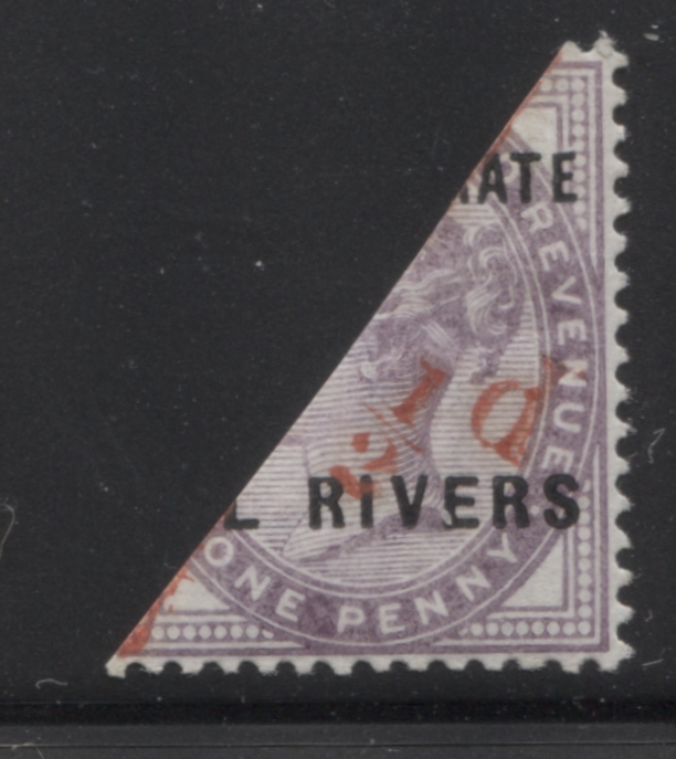
The Old Calabar One Shilling Surcharges
In December 1893, the 2d green and vermilion was surcharged with the words "One Shilling" in two lines, with a bar underneath "Shilling". The font used is upright Roman mixed case. it is found in violet, vermilion and black, with violet being the most common, though not common by any means. Generally, they can all be found inverted, diagonal or vertical, and the violet can also be found inverted and diagonal.
I do not have any genuine examples to illustrate here. But I do have a very crude forgery of a vertical violet overprint which has been added to a used 2d stamp from Great Britain:

Here, the cancellation for London S.W is a dead giveaway. But even without this, the crudeness of the surcharge itself is obvious. The Oil Rivers overprint is also crude and obviously not original.
The Old Calabar 5/- and 10/- Surcharges
The genuine examples of these stamps are some of the rarest items in all of the British Commonwealth, with only 32 of the 10/- and 28 of the 5/- being printed at all. These surcharges consisted of either "5/-", "10/-", or "20-" with a long bar underneath. The 5/- was on the 2d, while the 10/- was on the 5d and the 20/- was on the 1s. The 5/- is only known in violet and can be found inverted , vertical or diagonal. The 10/- is vermilion and can be found with the same varieties as the 5/-. The 20/- can be found in vermilion, violet or black. The violet can be found inverted. Each of these 20/- surcharges lists for between £140,000 and £180,000!
Of course I do not have any genuine examples. However I do have one fairly good looking ink-jet forgery of the 10/- on a genuine 5d stamp, and a complete facsimile that at first glance looks eye-catching, but quickly gives itself away:

At first glance the pale vermilion ink of the surcharge and the font looks pretty darn good. However, when you look closely with a loupe, you can see tiny dots of colour across the entire stamp where the surcharge appears. These are indicative that the whole thing has been applied using an ink-jet.
Here is a close up to show what I mean:

If you look in the white space around the Queen you can see dozens of tiny blue dots.
Here is the facsimile:

What gives this away is that the purple of the stamp is too dark and the colour of the surcharge ink is too dark.
The Opobo Provisionals
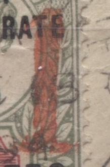
Between June and October 1894, there was a shortage of 1/2d stamps in Opobo. To alleviate the shortage, stocks of the 1d stamp were bisected and surcharged with a "1" in either vermilion or carmine as follows:
- The first type has a thick "1" that is 12 mm high in vermilion. This can be found double or inverted and in an unsevered pair.
- The second type is a smaller "1" that is only 4.75 mm high.
- The third type is a small "1" that is 3.75 mm high.
I have only seen the first type and I have in my possession one genuine example on piece and one very clever forgery, which has again been made using an ink jet printer and a genuine overprinted stamp:

Here is the genuine surcharge. Note how the colour of the ink is a vermilion, but how the design is still fully visible through it. Not also that the number appears weak in spots. Here is a closer look at the "1":

There are two major weak spots in the number - one at the top and one at the bottom.
Now, let's look at the forgery:

Here the number is too perfect, with no weak spots and uneven colour. Also the colour of the ink is not reddish enough to be a true vermilion. It is convincing though to an inexperienced collector.
Other Forgeries of the Overprints
The following are all examples of crude forgeries of some of the scarcer varieties of the overprints:

Here is an ink-jet forgery of the misplaced overprint on the 1d, where the top of the overprint appears at the bottom of the stamp, instead of at the top. Again, you can see the tiny blue ink-jet dots.

Here is a crude forgery of a double overprint in violet on a 1/2d G.B Jubilee stamp. For starters the overprint was never produced in violet, and to the best of my knowledge is not known doubled.

Here is an obvious ink-jet "Cancelled" overprint that has been applied to a genuine 1/2d stamp. The fuzziness of the lettering is the give away:

Larger Multiples of the Regular Overprinted Issues
This week, I will finish off with four blocks of the regular overprinted issue that show the plate differences in the overprint quite nicely. It should be noted that fresh blocks and pairs of the stamps of this issue are quite elusive, as the examples shown here are the only ones I have come across in many years of collecting.

Here is a nice mint never hinged block of the 1d with the bottom right stamp showing the three dots between the R and I of "Rivers", from position 100 in the sheet of 240. That means that this block is positions 87-88 and 99-100, This means that it comes from columns 3 and 4. If you look carefully at the left two stamps, you can see that the "B" of "British" is lower, relative to the other letters, while the "H" is raised.

Here we have a nice used block of the 2.5d from columns 5 and 6 of the sheet. The two stamps on the left side of the block show the B and H of "British" raised slightly, while on the two right stamps, the B is level with the other letters while the H is raised.

Here is a fresh mint never hinged block of the 2d, also from either columns 5 and 6, or columns 11 and 12 of the sheet.

Lastly, we have a beautiful, post office fresh, mint never hinged block of 4 of the 5d showing positions 105 and 117 of the overprint. Position 105, at the top right shows the malformed "R" and "T" of "Prot", while the "E" of "Ate" has a short, upturned foot. Position 117 at lower right shows the short "T" of "British" on the lower right stamp. These stamps were only issued in panes of 60, which means that this must be the 57th position from one of the overprint formes. So this is positions 46-47 and 56-57 in the sheet, which would be columns 11 and 12. This is indeed the case as the two left stamps show the B and H raised slightly, while the two right stamps show the B level and the H raised.
This concludes my coverage of this issue. Next week I will begin a series of posts about the first Waterlow issue of 1894.


Comments
Post a Comment