The Printings Of The 2d Lilac and Blue Keyplate Stamp of Lagos 1891-1904 Part Four
Today's post completes my examination of the printings of the 2d lilac and blue Queen Victoria. My last post about this stamp went as far as the fortieth printing, which as best I can determine, came from the third state of the plate. Today's post deals with the last printings, which would have been made between about August of 1897 to August 1901. Interestingly, and unlike some other values in the series, I have not seen any evidence that the new plate 2 was ever used to produce this value. Consequently, all of the printings in this group are from what I call the fourth state of the plate. In this state, most all of the detail in the Queen's hair at the top of the crown and at the base of the jewels is gone, as is all the detail at the back of the head. There is some thickening of the horizontal shading lines of the background, leading to unevenness in the thickness of these lines, and finally, some merging of the horizontal shading lines in the bands of the crown.
In the last group of printings, there was a shift from mostly used stamps to mostly mint. However, in this group there is a much more even balance of mint and used examples. We start to really see the use of the barred oval hammers fall away, and the larger 23.5 mm CDS cancels become predominant. Most of these are from Lagos, of course, but we do occasionally see other towns, such as Abeokuta and Ibadan.
Another aspect to this group of printings is that there are several examples of the constant plate flaw, the "damaged T" of "Two". As I have stated in past posts, this plate flaw dates all the way back to the very first printings made of the 2d, back to 1874, and examples of it can be found on every colour and watermark of the 2d, right up to the last printings in 1901, as it was never corrected.
Before I get into describing the printings of this last group, there are 10 groups of stamps, which I did not include in the previous ones, that really should have been included. The shades are all different from the earlier printings in some way, but it is doubtful whether all of these are truly separate printings, because there should only be about 56 printings of this stamp if one was made every three months during the life of the issue, and there appear to be approximately 14 printings in this last group, when added to the 40 that have already been identified, would give 54 printings. If these 10 are also considered to be separate printings, then that would give us 64 printings, which is too many. So some of these are likely just variations that occurred in the same run, or a few are changelings of the lilac colour due to moisture, but it is difficult to be sure, without further research, which is which. So for the purposes of this post, I will continue to call them printings, and will thus identify and describe all 64 "printings", but would again emphasize that at least 8 of these are likely just variations of the same printing.
Forty First Printing

Forty Second Printing

Forty Third Printing

Forty Fourth Printing

Forty Fifth Printing


The head plate colour of this printing is an almost perfect match to Gibbons dull purple. The duty plate colour is closest to Gibbons's deep ultramarine.
I have eight mint, and nine used examples, most of which are canceled with Lagos CDS cancels, one of which has had the date partially completed by hand, which is quite scarce. One example bears an October 6, 1902 Abeokuta CDS.
In this group, I also have two nice examples of the "damaged T". One is the mint stamp at the top right, and the other is the first used stamp in the second row:
Here is the mint stamp:

And here is the same plate flaw on the used stamp:


Here, the head plate colour is closest to Gibbons's dull purple, but the colour is much paler, and also has a brownish grey undertone. The duty plate colour is closest to Gibbons's dull ultramarine, but is a bit paler.
Sixty Second Printing


On this printing, the colour is more purple than the reddish lilac. It is actually closest to the deep reddish purple, but much duller. The duty plate colour is closest to deep ultramarine.
Again, this might be a stamp from one of the earlier printings that has been affected by moisture, but I would have to find another mint example to prove that it is truly a different printing.
This concludes my chronology of the printings of the 2d lilac and blue. The next stamp of interest in the series is the 4d lilac and black, which I will start to examine next week. The 1893 halfpenny surcharge will be examined alongside this, as these can be used to date the printings.
In the last group of printings, there was a shift from mostly used stamps to mostly mint. However, in this group there is a much more even balance of mint and used examples. We start to really see the use of the barred oval hammers fall away, and the larger 23.5 mm CDS cancels become predominant. Most of these are from Lagos, of course, but we do occasionally see other towns, such as Abeokuta and Ibadan.
Another aspect to this group of printings is that there are several examples of the constant plate flaw, the "damaged T" of "Two". As I have stated in past posts, this plate flaw dates all the way back to the very first printings made of the 2d, back to 1874, and examples of it can be found on every colour and watermark of the 2d, right up to the last printings in 1901, as it was never corrected.
Before I get into describing the printings of this last group, there are 10 groups of stamps, which I did not include in the previous ones, that really should have been included. The shades are all different from the earlier printings in some way, but it is doubtful whether all of these are truly separate printings, because there should only be about 56 printings of this stamp if one was made every three months during the life of the issue, and there appear to be approximately 14 printings in this last group, when added to the 40 that have already been identified, would give 54 printings. If these 10 are also considered to be separate printings, then that would give us 64 printings, which is too many. So some of these are likely just variations that occurred in the same run, or a few are changelings of the lilac colour due to moisture, but it is difficult to be sure, without further research, which is which. So for the purposes of this post, I will continue to call them printings, and will thus identify and describe all 64 "printings", but would again emphasize that at least 8 of these are likely just variations of the same printing.
Forty First Printing

On this printing, the head plate colour is closest to Gibbons's dull purple, but is deeper - almost like a dull version of the maroon swatch. The duty plate colour is closest to Gibbons's steel blue - a very distinct shade.
I have only the two mint examples shown above. This is very likely to be one of the earlier printings from the first or second state of the plate, which happen to show a bit more wear than normal. The colour is quite distinct, and is definitely scarce compared to the other printings.
Forty Second Printing

On this printing, the head plate colour is a perfect match to Gibbons's dull purple. The duty plate colour is closest to Gibbons's blue.
I only have this single used example, cancelled with what appears to be an 8-bar oval obliterator.
Forty Third Printing

On this printing, the head plate colour is closest to Gibbons' dull purple, but the colour is just a bit paler. The duty plate colour is closest to Gibbons's deep dull blue.
I only have the two used examples shown above, and no mint stamps. These both appear to have been cancelled with an 8-bar oval obliterator, though it is difficult to be completely sure.
Forty Fourth Printing

On this printing, the head plate colour is an almost perfect match to Gibbons's dull purple. The duty plate colour is closest to Gibbons's Royal blue, but the colour is just a touch duller.
I have one mint, and one used example of this printing, as shown above. The used stamp appears to have been cancelled with an indistinct CDS.
Forty Fifth Printing

The head plate colour on this printing is still closest to Gibbons's dull purple, though this colour is quite pale by comparison. It is too dull to be the reddish lilac, however. The duty plate colour is closest to Gibbons's deep dull blue, but just a bit brighter, and closer to pure deep blue.
I only have the one used stamp shown above, which is cancelled with what appears to be an 8-bar oval obliterator.
Forty Sixth Printing

The head plate colour on this printing is closest to dull mauve on the Gibbons colour key, but the colour is a bit deeper. The duty plate colour is an almost perfect match to Gibbons's ultramarine.
The left stamp has no gum and is hence unused. So it is possible, given how pale the head plate colour is, and the fact that the head plate was printed from singly fugitive ink, that this is a changeling caused by excessive exposure to moisture. Finding an additional mint copy with original gum would settle the question of whether or not this is truly a different printing.
Forty Seventh Printing

The head plate colour of this printing is very close to dull mauve. Again, the stamp on the right is a close to perfect match to Gibbons's dull mauve, but the one on the left is slightly deeper. The duty plate colour is closest to Gibbons's ultramarine.
I have only the two used stamps shown above, and no mint examples. The stamp on the left appears to be cancelled with an 8-bar oval obliterator, while the one on the right is clearly cancelled with a 9-bar obliterator.
Forty Eighth Printing
The head plate colour on this printing is closest to Gibbon's dull purple but is a bit paler. The head plate colour is closest to Gibbons's dull blue.
I have only the above used example, which is quite severely toned and discoloured. It is cancelled with a 9-bar oval obliterator.
Forty Ninth Printing

The head plate colour on this printing is closest to Gibbons's deep dull purple. The duty plate colour is closest to Gibbons's deep ultramarine.
I have only the above used stamp, and no mint. It is a very distinct shade combination, and is cancelled with what appears to be a light strike of an 8-bar oval obliterator.
Fiftieth Printing

The head plate colour of this printing is closest to Gibbons's reddish lilac, but is quite a bit duller. The duty plate colour is an almost perfect match to Gibbons's blue.
I have only the above used example. It is cancelled with two overlapping strikes of an 8-bar oval obliterator.
Group IV - Printings Made From The Fourth State of The Plate - August 1897 to August 1901
Fifty first Printing

The head plate colour of this printing is closest to Gibbons's dull purple, but is paler. The duty plate colour is a perfect match to Gibbons's Royal blue. I have one mint example as shown above, and three used examples as shown below:

This is the first printing in which we see the wide CDS cancel begin to replace the oval obliterator. There are two different Lagos CDS cancels here, with the October 16, 1898 one on the left being wider than the one dated October 20, 1903. The stamp on the right is cancelled with what appears to be a 9-bar oval obliterator.
Fifty Second Printing

The head plate colour of this printing is an almost perfect match to Gibbons's dull purple. The duty plate colour is closest to Gibbons's Royal blue, but is just a bit duller.
I have four mint examples of this printing, and one used one. The used stamp has a strike of a Hamburg German Steamship cancel. Unfortunately I cannot see the date, but it is probably sometime in 1898 or 1899.
Fifty Third Printing

The head plate colour of this printing is closest to Gibbons's dull purple, but is paler. The duty plate colour is closest to Royal blue, but is a bit paler and duller. It is close to ultramarine, but is too saturated to be ultramarine.
I have only the single used example shown above, cancelled with an 8-bar oval obliterator strike.
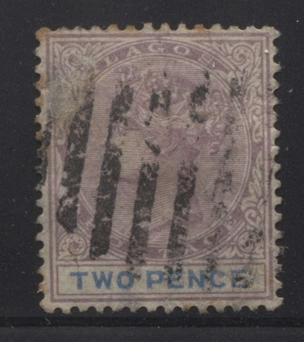
This example shows a clear example of the constant plate flaw, Damaged T in "Two". In this flaw, as discussed in other posts, there is a small chunk taken out of the vertical leg of the "T" on the right side. Here is a close up scan of the flaw:

Fifty Fourth Printing

The head plate colour of this printing is closest to Gibbons's reddish lilac, but is both greyish and quite a bit paler than the pure reddish lilac colour. The duty plate colour is closest to Gibbons's bright blue, but slightly duller.
I only have the above used example, which unfortunately is scuffed on the surface at the right, but is cancelled with a beautiful socked on the nose strike of an Abeokuta CDS dated August 21, 1899.
Fifty Fifth Printing

The head plate colour of this printing is an almost perfect match to Gibbons's dull purple. The duty plate colour is closest to Gibbons's dull ultramarine. All the examples that I have are mint, as shown above.
Fifty Sixth Printing

The head plate colour of this printing is an almost perfect match to Gibbons dull purple. The duty plate colour is closest to Gibbons's deep ultramarine.
I have eight mint, and nine used examples, most of which are canceled with Lagos CDS cancels, one of which has had the date partially completed by hand, which is quite scarce. One example bears an October 6, 1902 Abeokuta CDS.
In this group, I also have two nice examples of the "damaged T". One is the mint stamp at the top right, and the other is the first used stamp in the second row:
Here is the mint stamp:

And here is the same plate flaw on the used stamp:

Fifty Seventh Printing

The head plate colour of this printing is closest to Gibbons dull purple also, but on this printing, the colour is just so slightly paler. The duty plate is close to ultramarine, but it is both slightly deeper and duller.
I have three mint, and eight used examples of this printing. All of the used examples appear to be cancelled by either Abeokuta or Lagos CDS's. The dated cancels both appear to be after 1900.
Fifty Eighth Printing

The head plate colour of this printing is closest to Gibbons's dull purple, but is a bit more brownish than the other printings. The duty plate colour is an almost perfect match to Gibbons's dull ultramarine.
I have one mint example and three used examples, all of which are cancelled with either Lagos or Ibadan CDS cancels dated between 1901 and 1902.
Fifty Ninth Printing

The head plate colour of this printing is closest to Gibbons's dull purple, but is a bit more brownish than the other printings. The duty plate colour is closest to dull ultramarine. I only have the one mint example shown above.
Sixtieth Printing

The head plate colour of this printing is closest to Gibbons's dull purple, but is a paler. The duty plate colour is closest to Gibbons's deep ultramarine.
I have one mint example, and two used examples. The used stamp on the left was cancelled in the UK, so it was likely mailed on a ship.
Sixty First Printing

Here, the head plate colour is closest to Gibbons's dull purple, but the colour is much paler, and also has a brownish grey undertone. The duty plate colour is closest to Gibbons's dull ultramarine, but is a bit paler.
Sixty Second Printing

Here, the head plate colour is closest to Gibbons's dull purple, but the colour is much paler, and also has a brownish grey undertone. The duty plate colour is an almost perfect match to Gibbons's ultramarine.
Sixty Third Printing

On this printing, the head plate colour is closest to Gibbons reddish lilac, but a little duller. The duty plate colour is closest to Gibbons's royal blue.
I only have the used example shown above. Because of the reddish appearance of the colour, it is entirely possible that this has been affected by moisture. Only another mint example with gum that matches this will settle this for certain.
Sixty Fourth Printing

Again, this might be a stamp from one of the earlier printings that has been affected by moisture, but I would have to find another mint example to prove that it is truly a different printing.
This concludes my chronology of the printings of the 2d lilac and blue. The next stamp of interest in the series is the 4d lilac and black, which I will start to examine next week. The 1893 halfpenny surcharge will be examined alongside this, as these can be used to date the printings.


Thank you very much for sharing information that will be much helpful for making coursework my effective.
ReplyDeleteYou are welcome!
DeleteOut of curiosity, what course are you taking for which these posts are useful?
Delete