The Printings Of The 2.5d Ultramarine Queen Victoria Keyplate Stamp of Lagos 1891-1904 Part One
Overview
Today's post deals with what in my opinion is one of the most remarkable stamps from the 1887-1903 Crown CA Lagos issue: the 2.5d ultramarine. The introduction of a single UPU rate for mail to all foreign destinations other than the UK, of 2.5d per half ounce, created a need for this value, and it was first dispatched to the Colony on April 15, 1891. It is the only stamp from the series, for which there were no remainders whatsoever. In all, 428,040 stamps were printed, so there will have been a very large number of printings - likely well over 40. Given that stamps were supplied on a quarterly basis, and there would have been three quarters left in 1891, there could be up to 43 printings. I have identified more than this number in my sort of 183 mint and used examples, so it is likely that some of the varieties I have found are merely sub-types of some of the printings.
The stamp follows the usual progression of plate wear, though on this value it seems that it never gets to stage 5, as I have not come across any really coarse examples. However, it does appear that there were some printings made in 1901 from plate 2, as many of my dated used examples from after 1901 possess a clarity that is uncharacteristic of printings made at this time, which does suggest that they are from a new plate.
The main thing that is interesting about this stamp is the very vast array of subtle shades, and the fact that quite often the head and duty plate shade dates are quite different. The basic colour is identified as being ultramarine, but in reality there is a very wide range of shades. Gibbons does list a scarce blue shade, in the type A duty plate (to be discussed in a minute), but it is really quite a greenish blue. In addition to this shade, there are several other very scarce shade combinations. The second interesting thing is the differences in the duty plate letters. Gibbons lists two types:


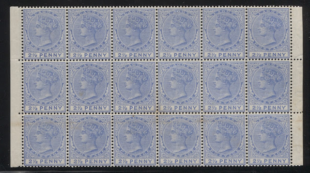
Here we have a block of 18 from the middle of the sheet. Most of the design detail is clear and the degree of wear seems to be similar on all stamps. Some of the stamps in this block are type B, such as the second stamp from the left on the bottom row, while others, such as the third stamp from the left in the top row, are type A.


Today's post deals with what in my opinion is one of the most remarkable stamps from the 1887-1903 Crown CA Lagos issue: the 2.5d ultramarine. The introduction of a single UPU rate for mail to all foreign destinations other than the UK, of 2.5d per half ounce, created a need for this value, and it was first dispatched to the Colony on April 15, 1891. It is the only stamp from the series, for which there were no remainders whatsoever. In all, 428,040 stamps were printed, so there will have been a very large number of printings - likely well over 40. Given that stamps were supplied on a quarterly basis, and there would have been three quarters left in 1891, there could be up to 43 printings. I have identified more than this number in my sort of 183 mint and used examples, so it is likely that some of the varieties I have found are merely sub-types of some of the printings.
The stamp follows the usual progression of plate wear, though on this value it seems that it never gets to stage 5, as I have not come across any really coarse examples. However, it does appear that there were some printings made in 1901 from plate 2, as many of my dated used examples from after 1901 possess a clarity that is uncharacteristic of printings made at this time, which does suggest that they are from a new plate.
The main thing that is interesting about this stamp is the very vast array of subtle shades, and the fact that quite often the head and duty plate shade dates are quite different. The basic colour is identified as being ultramarine, but in reality there is a very wide range of shades. Gibbons does list a scarce blue shade, in the type A duty plate (to be discussed in a minute), but it is really quite a greenish blue. In addition to this shade, there are several other very scarce shade combinations. The second interesting thing is the differences in the duty plate letters. Gibbons lists two types:
- On the more common type A lettering, the letters are thin, the fraction bar is thinner and has a straight top, or ends in a straight point.
- On the scarcer type B, the letters are slightly larger and bolder. The fraction bar has a slightly curved top, almost resembling a serif.
These two types are thought to have been mixed on the same plate and in practice, they can be quite difficult to distinguish. The large multiples that I have in my possession suggest that this is indeed the case on some printings, but not on others. I measured a known type A and a known type B, as I felt that the measurement of the letters would likely differ in some way, and that this would provide a more reliable way to distinguish the two types. Part of the problem in distinguishing these two types is that there are several examples where the fraction bar is very slightly curved, being mid-way between straight and curved, and the difference in size of the letters can be very hard to spot.
What I found was:
- On type A, the width of the inscription is exactly 15 mm. All the letters except for the "P", the 2 and the fraction are exactly, or almost exactly 1.5 mm tall, and 1.5 mm wide, except for the fraction, which is 2 mm wide. The "P" is generally 1.75 mm tall. The fraction bar is 2 mm long.
- On type B, the width of the inscription is just a smidge wider than 15 mm. All the letters except for the "P" and "E", the 2 and the fraction are exactly, or almost exactly 1.75 mm tall. The "P" is very close to 2 mm tall and the "E" is still 1.5 mm tall. The fraction is also 2 mm wide, and the "Y" is also very close to 2 mm wide. All the other letters and the 2 are 1.5 mm wide, as in type A. So essentially, the letters are generally 0.25 mm taller on type B, as compared to type A. The fraction bar is generally 2.25 mm long.
When I examine the larger multiples with these characteristics in mind, it becomes clear that all stamps on one pane are either type A or type B. It is possible that in a sheet the left pane is type A while the right is type B. Ince suggests that only 25% of the total printing was type B, so there may have been printings that were only type A, or B for both panes. Some of the type B stamps, do look almost like type A until you measure the height of the letters.
Here is a scan from the larger block of 36 below that shows two adjacent stamps, that at first appear to be different types, but are seen to both be type B, once measured:

On here you can see that the fraction bar of the top stamp has the curved top normally associated with type B, but on the bottom stamp it look more straight, like type A. However, the Y's of both stamps are 2 mm wide and the letters are mostly 1.75 mm tall, instead of 1.5 mm.
The scans below show the large multiples in my possession:

This block of 4 from positions 46, 47, 56 and 57 in the sheet shows the current number 1, which as explained in another post, is a registration number showing the order in which the plates were laid down. Since there was only 1 plate for Lagos prior to 1901, and the use of these numbers was abandoned after 1890, they are always "1" for Lagos issues. The presence of that number on this block suggests that this is from one of the first printings. However, the clarity of the impression is different for the top two stamps, which show almost no detail in the hair on the back of the head, and more merging of the top 5 hairlines, whereas there is more detail in the hair on the back of the head on the bottom two stamps. All four stamps are type A.

Here we have a block of 6 from positions 43-44, 49-50 and 55-56 in the sheet. Again, this sheet shows the current number, which suggests that it is a pre-1892 printing. The degree of visible plate wear is about the same on all six stamps. There is some merging of the top 5 hairlines at the top of the head, and there is sole loss of detail in the hair at the back of the head. However, most of the detail is still visible. All six stamps are type A.

Here we have a block of 18 from the middle of the sheet. Most of the design detail is clear and the degree of wear seems to be similar on all stamps. Some of the stamps in this block are type B, such as the second stamp from the left on the bottom row, while others, such as the third stamp from the left in the top row, are type A.

Finally, I have a block of 36 being the entire left hand pane from rows 5-10. This also has the current number, suggesting that is is a pre-1892 printing. The degree of plate wear varies considerably between stamps in this sheet, as shown in the scans below. Again, some of the stamps in this sheet are type A, while others are type B.
There is one key revelation that comes from these multiples that will impact not just my research findings with regard to this stamp, but may also alter many of the conclusions that I reached about the other stamps I have studied so far in this issue, as well as the earlier issues, and that is that the plate did not wear evenly. The largest block here, containing 36 stamps, shows examples that have the clarity associated with early printings where the all the detail in the hair is visible, except for the merging of the top three hairlines, se-tenant with others that show the wear associated with late printings. Either that, or the differences we are seeing result from over inking.
Here are some examples of what I mean:

Here we have a pair from the right side of the sheet in which the stamp on the left shows much clearer detail in the hair at the back of the head, whereas the stamp on the right shows almost no detail in the hair at the back of the head.
Conclusion
Clearly, while the degree of plate wear provides some insight into when a particular stamp might have been printed, the examination of individual stamps for clarity of impression does not yield foolproof results. It is quite likely where I have found stamps that are the exact same shade, that those stamps are quite likely to be from the same printing, rather than separate ones.
So I will have to go over the 71 "printings" I have identified and consolidate them given this information that I have uncovered. It will then be necessary at some point to go back and re-visit my previous sorts to see if some of the other stamps need to be consolidated into fewer printings.
So next week's post will look at the individual printings that I identify, once this process is complete.


Comments
Post a Comment