The Printings Of The 2.5d Ultramarine Queen Victoria Keyplate Stamp of Lagos 1891-1904 Part Three
Today's post resumes where I left off with the tenth printing of the 2.5d ultramarine Queen Victoria keyplate issue, through the sixteenth printing.
A few more possibly constant plate flaws make their appearance on the printings detailed in this post:
Tenth Printing
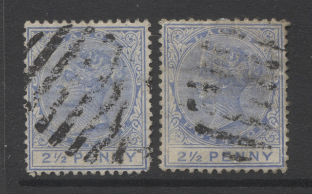
On this printing, the head plate and the duty plate are both the same colour, and it is closest to dull ultramarine, being an almost perfect match, and having none of the brightness that the stamps of printings seven and eight had.
I have two used examples, both type A, and not in the greatest condition. Both are cancelled, with what appear to be 8-bar oval obliterators.
Eleventh Printing

On this printing, the head plate and the duty plate are different. The head plate colour is a pale, dull ultramarine, while the duty plate is dull ultramarine.
Again, I have two used examples, which, once again, are both type A, and are both cancelled with 8-bar oval obilterators.
Twelfth Printing

On this printing, the head and duty plate are both the same colour, which is close to Gibbons' bright blue, but paler. It lacks the chalky blue undertone that the dull ultramarine has, and variations of this colour will prove to be quite prevalent in the later printings. I have a single used example, which I am fairly certain is type A also. It appears, just on the basis of the thickness of the cancellation bars, to have been cancelled with an 8-bar oval obliterator.
Thirteenth Printing

On this printing, the head plate colour is very similar to the eleventh printing in that it is very close to pale dull ultramarine, except on this printing the colour is a bit brighter, with just a touch more blue than that printing. The duty plate colour is dull ultramarine, just as was the case with the eleventh printing.
I have four used examples of this printing in the type A, and one used and two mint examples with the scarcer type B. One of the used type A's is canceled with a German steamship cancel, while the others appear to be cancelled with the thinner 9-bar oval obliterators.
Fourteenth Printing

This is one of the most distinct printings of this value because of the significant disparity between the head plate and duty plate colours. It is so significant that it boggles the mind that it would not be listed as a separate catalogue number in Gibbons. The duty plate colour is grey blue, which is not found on any of the other printings, while the head plate colour is dull ultramarine.
I have five mint examples, two of which are shown here. Four have no gum, and the other, only partial disturbed gum. I also have four used examples, all of which appear to be cancelled with the 9-bar obliterator. All nine stamps are type A. The lack of gum on these leads me to think that this may be the April 1894 printing, as this was sent exactly three years after the first shipment and thus the timing is about right. The April 1894 printing arrived in the colony with a large number of the stamps stuck together, so that they had to be soaked apart. This was written about in Jack Ince's reference work on the stamps of Lagos, and this is the only printing I have, in which none of the mint stamps have full original gum.
Here is a close-up of the two mint examples, so that you can see the difference between the head plate and duty plate colours:

Fifteenth Printing

In this printing, both the head plate and the duty plate are dull ultramarine, although now the shade has become just a bit brighter than the last printing. I have one mint and five used type A's, and two mint type B's. The used type A's are cancelled with a mixture of 8-bar and 9-bar oval obilterators.
On this printing, the type B mint examples exhibit two of the varieties that were written about in the last post, and this post, namely:


Note the much deeper colour of the duty plate in relation to the head plate. Also note how there is a slub on the top of the "P", while the top of the "E" appears to have had a slice taken out of it.
That is all I have time to go through this week. As I anticipate a total of about 40 printings for this stamp, I think it will be two more weeks before I have properly identified and documented all of the printing differences.
A few more possibly constant plate flaws make their appearance on the printings detailed in this post:
- A white dot inside the "Y" of "Penny".
- The letters "PE" of "Penny" deformed by having a slub on top of the "P" and a small divot taken out of the top of the "E". This would appear to be constant, as I have seen the same variety on several of the 2.5d stamps.
- "2" with an elongated top, and weak left outer frameline. Normally the top of the "2" ends well above the the bottom of the "1" of "1/2". But on this variety, the top of the 2 is almost level with the bottom of the "1".
Tenth Printing

On this printing, the head plate and the duty plate are both the same colour, and it is closest to dull ultramarine, being an almost perfect match, and having none of the brightness that the stamps of printings seven and eight had.
I have two used examples, both type A, and not in the greatest condition. Both are cancelled, with what appear to be 8-bar oval obliterators.
Eleventh Printing

On this printing, the head plate and the duty plate are different. The head plate colour is a pale, dull ultramarine, while the duty plate is dull ultramarine.
Again, I have two used examples, which, once again, are both type A, and are both cancelled with 8-bar oval obilterators.
Twelfth Printing

On this printing, the head and duty plate are both the same colour, which is close to Gibbons' bright blue, but paler. It lacks the chalky blue undertone that the dull ultramarine has, and variations of this colour will prove to be quite prevalent in the later printings. I have a single used example, which I am fairly certain is type A also. It appears, just on the basis of the thickness of the cancellation bars, to have been cancelled with an 8-bar oval obliterator.
Thirteenth Printing

I have four used examples of this printing in the type A, and one used and two mint examples with the scarcer type B. One of the used type A's is canceled with a German steamship cancel, while the others appear to be cancelled with the thinner 9-bar oval obliterators.
Fourteenth Printing

This is one of the most distinct printings of this value because of the significant disparity between the head plate and duty plate colours. It is so significant that it boggles the mind that it would not be listed as a separate catalogue number in Gibbons. The duty plate colour is grey blue, which is not found on any of the other printings, while the head plate colour is dull ultramarine.
I have five mint examples, two of which are shown here. Four have no gum, and the other, only partial disturbed gum. I also have four used examples, all of which appear to be cancelled with the 9-bar obliterator. All nine stamps are type A. The lack of gum on these leads me to think that this may be the April 1894 printing, as this was sent exactly three years after the first shipment and thus the timing is about right. The April 1894 printing arrived in the colony with a large number of the stamps stuck together, so that they had to be soaked apart. This was written about in Jack Ince's reference work on the stamps of Lagos, and this is the only printing I have, in which none of the mint stamps have full original gum.
Here is a close-up of the two mint examples, so that you can see the difference between the head plate and duty plate colours:

Fifteenth Printing

In this printing, both the head plate and the duty plate are dull ultramarine, although now the shade has become just a bit brighter than the last printing. I have one mint and five used type A's, and two mint type B's. The used type A's are cancelled with a mixture of 8-bar and 9-bar oval obilterators.
On this printing, the type B mint examples exhibit two of the varieties that were written about in the last post, and this post, namely:
- The deformed letters "PEN" of "Penny" on the left stamp,
- The elongated "2" and weak left frameline on the right stamp.
The close up scan below should show both of these varieties clearly:
 |
Sixteenth Printing

On this printing, the head plate is still dull ultramarine, but once again, it has gotten just a little bit brighter. The duty plate colour however, is distinctly royal blue. I have two used type A's and six mint type B's, plus one used type B. Of the type B's, one shows the deformed "PE" of "Pence", as shown in the scan below:

Note the much deeper colour of the duty plate in relation to the head plate. Also note how there is a slub on the top of the "P", while the top of the "E" appears to have had a slice taken out of it.
That is all I have time to go through this week. As I anticipate a total of about 40 printings for this stamp, I think it will be two more weeks before I have properly identified and documented all of the printing differences.


Comments
Post a Comment